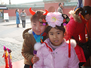
Here's my pic from The Temple of Heaven in Beijing China:

I love this cute pic of these sweet little girls but I took it with the flash and they seem a little washed out and the sun in the background is kinda making the lighting weird. All I did to edit this was crop it in camera. I'd LOVE any suggestions. And honestly, I can't tell y'all any of the EXIF data cause I don't know where to find that! :) HELP! Thanks in advance for your comments!!! Oh, I have photoshop elements 6 for Mac. And i'm still learning that too! This is all new to me y'all!
LOVE,


O.k. Your settings are: ISO 200 | f/3.5 | 1/100.
ReplyDeleteI found the settings by right clicking on the large version and using Opanda IEXIF, a plugin for Firefox. You can find them in Picasa by right clicking and clicking "properties." You might not be able to see the ISO. Nikon records it in a strange place, LOL. So you can use Opanda the stand-alone version. It's free :).
I like the lighting in the background. And they don't look flat to me. I would crop to 8x10 vertical keeping all of her one hand and the hat on the other child. The small people in the background don't bother me. I used Picasa to do a quick edit. I did "I feel lucky" in and then auto color. Then bump the fill light up and bit and the shadows down.
I hope that helps!
Amanda J.
Thanks so much Amanda! I'm gonna try those suggestions and post what I come up with! :)
ReplyDeleteI am by no means a pro but I wanted to play with your photo. I used Picnik cause it is free. I adjusted the exposure and contrast a bit. The string in the girls face bothered me so I cloned it out and removed the people in the background too. I added the Orton-ish effect and reduced it on the slider. Here is the link to the finished product. I think it is still a little too reddish.
ReplyDeletehttp://picasaweb.google.com/lh/photo/H1tZGNKI9L8ATxPfxTrCmA?feat=directlink
Hi Courtney,
ReplyDeleteThese two girls are adorable - this photo is perfect for Hat Week! :)
Here are some things that I would have done to improve this photo before I even took the shot:
1) I would have stood a lot closer to the girls to help eliminate the distracting elements in the background and to put the focus right on their beautiful faces.
2) I would have crouched down to take the photo. When I was working with this photo, there was no way to leave the taller girl's hat in the photo and get rid of the man behind them as well. This could have been taken care of by shooting your photo from a different angle.
Photo Editing:
Here is my very quick edit that I did on your photo: http://www.flickr.com/photos/thearthurclan/3513820872/
1) When I edited your photo in Photoshop, I ran actions on it to boost the color and to brighten the girl's faces.
2) I then cropped the photo to 5x7 (one of the most visually appealing crops to use and also to get rid of some of the distracting elements in the background of the photo.)
3) Because of the cute hat, I had to crop the photo with the man still behind the girls. To tone him down a bit, I added a texture to the photo. To be honest with you, I didn't really like this texture for this particular photo, but didn't have time to go find one that looked better. :) Due to that, I just added it so that you'd have an idea of how it can help get rid of background stuff.
I hope this helps you a bit!
~Angie
co-founder of iHeartFaces
fun stuff Court :)
ReplyDeleteCourtney, these little girls are just beautiful, and I love the photo. The way the faces are angled in the photo is wonderful.
ReplyDeleteAs you become more comfortable with your camera and experiment more, you may find that you don't need to use your flash as often. This setting is tricky because of the backlighting.
I like the backlit nature of the photo, though, and I wanted to keep the feeling of the light. I lightened the girls' faces, especially the one on the right. I also sharpened their eyes a little and cloned out the harsh hotspots from the flash on the teeth.
I decided to crop horizontally to eliminate as much of the background as possible. I debated about this...I love the hand of the taller girl on the other, and you may want to capture the environment of the Temple area, so more background would do that. I decided to treat this as more of a portrait, but there is no right or wrong. You get to decide as the artist!
I cloned out everything I could from the background except the structure.
I used an action called Flare-Up Golden from Totally Rad Actions to play up the look of the backlit sunflare.
Here is the link to my play:
http://www.flickr.com/photos/artfromtheheart/3513505429/
I am certainly not convinced that mine is the best fix. Food for thought, though!
Thank you for sharing this delightful photo.